Friday, 10 April 2015

Magazine Madness: Natalia Vodianova on PORTER Spring 2015

Issue 7 2015 Heroine Chic

While Issue 7 exactly makes PORTER magazine’s one-year anniversary, Russian supermodel Natalia Vodianova and the scarlet red tone catches my gazes. After flipping several pages at Stockmann, I found PORTER adapts halftone glossy paper, and the style of photography conveys a touch of TATLER feels. With no doubt I know PORTER is powered by Net-A-Porter, one of the largest luxury brand shopping website, my only concern is that if PORTER would be a too highly commercial catalogue.


Editor-in-Chief Lucy Yeomans’ letter of the season takes up 2 pages, aside from the brief tour of the contents of Issue 7, she also shares in Spring 2015, what’s in her mind is looking forward to, not just only Christopher Kane blouse or Chanel sheer powder, but also the artist John Singer Sargent exhibition at London’s National Portrait Gallery (tate.org.uk). On contributors’ page, the talents’ brief CV is shown and making readers realizing how a magazine is being produced. PORTER Spring 2015 major theme is ‘Heroine Chic’, therefore, ‘Who is your ultimate heroine?’ is asking around among the contributors, and it’s really intriguing to see how these fashion professionals’ ways of thought.

Russian supermodel Natalia Vadianova’s fairy tale stories on becoming designers’ muse, separated from aristocrat Justin Portman and the relationship with LVMH heir Antoine Arnault, is fairly known. With too many fashion magazine focuses on TV-reality quacks or armature celeb-designers, it’s fresh to read the voices of a professional model/mother/philanthropist, who usually must keep silent during the catwalks.


Among 17 full pages of interview readers know not only what Natalia’s comments toward her life, but memorize the foundation she has been establishing for the support of female education in Russia, Naked Heart. Under photographer Ryan McGinley’s lens, Natalia is same time mysteriously exotic, strongly spirited and girly innocent. Natalia once said “even those who are closest to me now cannot comprehend just what kind of life I lived—even the worst scenarios they can imagine would have been a good reality for me” (Yeomans, 134). 

We would never know if Natalia’s marriage decision was trying to get a life for herself in a new land after a poverty stricken time in Russia, and among the lines of interview, the quotes from the top designers’ are, no surprisingly, filled with warmly praises, not even a single doubt, still, Natalia, via her smiles and eyes, among so many fashion faces, is one of a few that I would vote/purchase for only judging through the magazine covers.


I am also amazed by Photographer Norman Jean Roy and Fashion Editor Cathy Kasterine’s contribution, ‘Prairie Rose’, which portrait model Toni Garrn in cinched-in silhouettes and fluid fabrics. The dry land, the brown grass, the dying tree and the blue sky reflects a wild romantic landscape of delicate yet strong SS15 fashion. With Nina Ricci white silk blouse, Alberta Ferretti dress or a black cowboy hat, Toni Garrn sometimes looking away on the tree trunk, occasionally glancing back to the readers, or with a close-up portrait. I like how the colour combined and how various angels to capture a female’s nostalgic beauty. 

PORTER magazine may be highly commercial on at the footnote reminder ‘Shop Porter with the NET-A-PORTER App’ at every single page, and vice versa on its shopping website, but for the production and artistic scales, PORTER’s clean layout, encouraging themes, strong feminism, the choices of models, good balance between advertisements and contents, and most importantly, the very high fashion photography, from those has already erase my concern of buying a commercial catalogue, but more of a fashion art archive to cherish and collect.

Works Cited & Photography:

More about Photographer Norman Jean Roy, please visit: 

SHARE:

Wednesday, 1 April 2015

Beauty Boom! Dior Le Vernis Bloom Fuchsia #777

Dior Vernis Bloom #777

One of the highlights of 2014 spring beauty collection of Dior is the nail polish. Totally six new le vernis released globally, and four of which are available in Europe. After Chanel Sweet Lilac#615, I bargain hunted Dior Vernis Bloom #777 at winter sale, I hoard this lacquer until today because I would like to give my toenails some vibe during my Easter holidays.

DIOR Vernis series box design is gliding pressed with silver, on ‘DIOR VERNIS Dior’ and a bold line above the basic info ‘e 10ml-0.33 FL.OZ’. Unpacking the Royal blue box, the silver texture main cap is undercut the monogram of Christian Dior, CD, while the black polish wand is rather convex engraved the 2 alphabets ‘CD’. The label ‘Dior Bloom 777’ is a transparent sticker on the glass bottle, as well the info on of the bottom. The external design in comparison with Chanel Le Vernis is less detailed.


Dior Vernis Bloom is for those who would like something more vibrant for the springtime. It has a slightly jelly character from the formula, one coat is thick enough to perform its Fuchsia pink, but by two coats, it was opaque on my toenails. It is a vivid and cheerful shade for the warmer days. Alas that Dior Vernis wand is too tiny (9 cm, while Chanel is 13 cm) to hold still and apply coating on my toenails, and the brush is too flat to run over the corner parts of nails. Still, the texture is rich and under the different lights, the fuchsia would change a bit redder and shine.

I take Dior Vernis photos alongside with ELLEFrance Janvier 2015, since Miss Dior is the cover girl and the font colour of ELLE and Bloom #777 are perfectly matched!

What’s your April days colours?

SHARE:

Tuesday, 31 March 2015

Art Attack: Design Museum Helsinki: Postmodernism 1980-1995


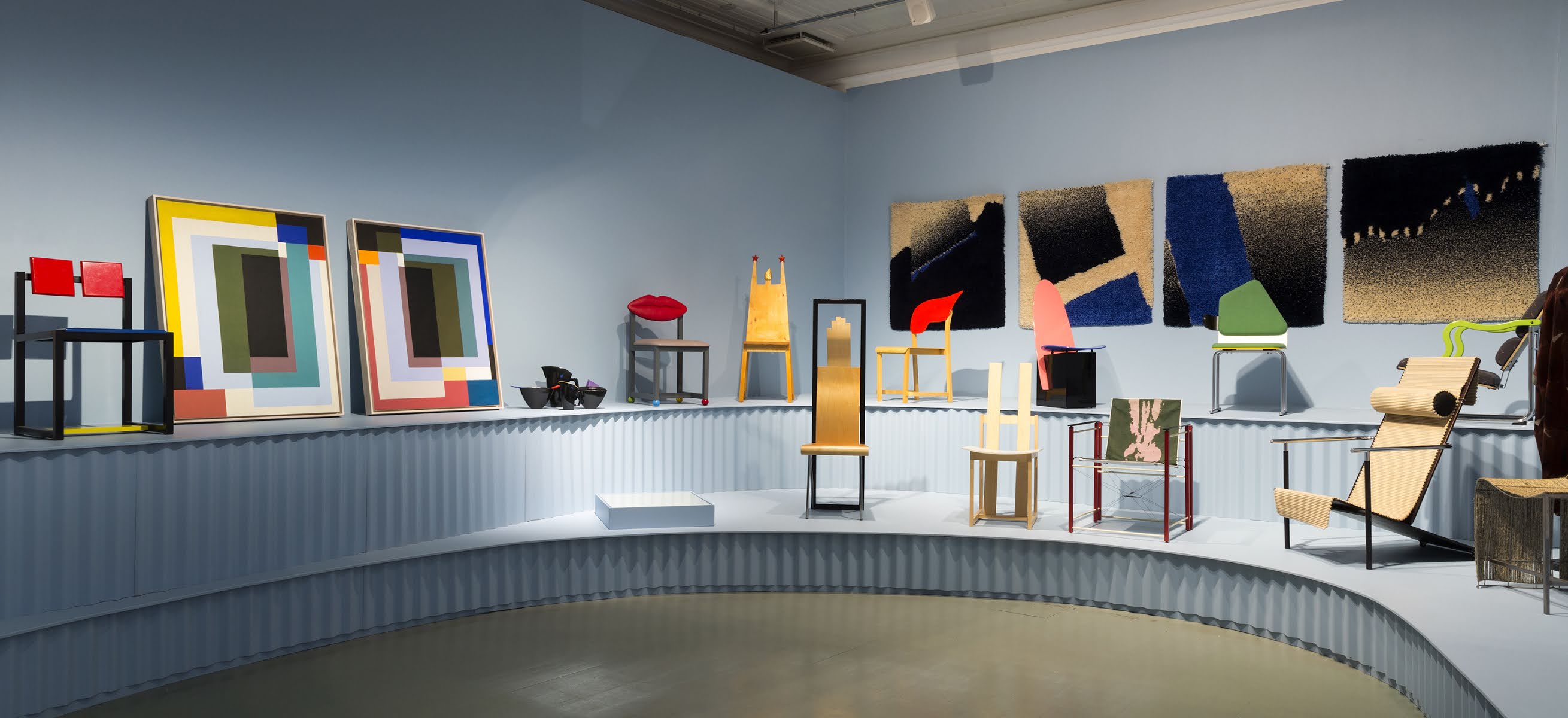
Taking tram no. 10 to the Design Museum Helsinki, on Floor 0 displays Finnish lamp designer Paavo Tynell’s sketches; Floor 1 shows Finnish Collection Exhibition, from Arabia to Minna Parikka; and upper floor catches my major purpose: Postmodernism 1980-1995. Succeed to ‘modernism’, the term ‘post-modernism’ includes skeptical interpretations of art, architecture, culture philosophy, history, economics, fiction and literary criticism. It is often associated with deconstruction and post-structuralism. On art creation, postmodernism avoids traditional themes on portraits, landscapes or still life paintings, since the artists would be more pleased adapting different kinds of materials, from plastic to metals to express the concerns of current societies: slums, overcrowding, deteriorated infrastructure, pollution, disease, consumption, labour markets and among others. On the description poster, this is how Design Museum Helsinki defines postmodernism:

‘Postmodernism was regarded as sales promotion: invigorating with the market momentary innovations instead of durable high-quality products.’


Roy Lichtenstein, one of my favourite postmodern artists, his painting ‘I love Liberty’ is lifting up my great surprise. Aside from Lichtenstein’s ‘metropolitan love’ topic, the Statue of Liberty in the frame seems more a masculine silhouette, heading down, standing in purple rain, rather than a pure chaste femme. Finnish painter Jarmo Mäkillä’s Uponnut Atlantis II (the Sunken Atlantics II) combine perhaps Marvel heroism, medical autonomy, post-orientalism or perhaps, just his dreams. Especially in the middle painting of the 6, the strong male hands grabbing at exposure organs, is both violent and obnoxious, but at the same very strongly attractive.

As for the ‘market orientation’ exhibition, I find Finnish fashion designer Vuokko Nurmesniemi’s black dresses are fun. The dresses made with velvet fabric, mixing seventeenth century Flemish outwear and also matching a touch of Star War costumes. For the fans of Finnish design, Lady Nurmesniemi is the name must note: Born in 1930, Helsinki, she is one of the two leading designers of Marimekko. Her signature striped Jokapoika (It Boy) shirt helped to make the company’s brand establishment.

For the sculpture, Born in 1931 in Milano, Italian designer and architect Alessandro Mendini’s colourful urns make me wonder if that’s the final residence of human flesh, in a comic and childlike tribute. Mendini’s kitchenware design for Alessi, are always full of lovely smiles and tropical jungle aurora. The key element of his design is always a clever hybrid resulting in popular objects that achieve great commercial success.

On furniture, the numerous styles of chairs at upper floor and main exhibition, obviously, are not for the purposes to be seated, but it’s always interesting to imagine how comfortable they will be while being heated up. For these cute chairs, I take quite some photos as well. The entrance/exit of Design Museum Helsinki is decorated with dozens of Finnish well-known scissors—Fiskars. Founded in year 1649, yes, 366 years ago, a metal and consumer brands in Finland, its best sellers has been including scissors, axes and high-quality knives. Almost every family in Finland owns at least a pair of bright orange Fiskars scissors and a fruit knife at kitchen drawer. The hallway deco of Fiskars is a great way to demonstrate and salute to the Finnish design, at the same time sending the direct and warm messages to we the design fans around the world.

For more info about Jarmo Mäkillä, Vuokko Nurmesniemi of Marimekko, and Alessandro Mendini, please visit: 

Works Cited & Photography: 
SHARE:

Friday, 20 March 2015

Accessories Accede: What’s in My Vanessa Bruno Sac?

Espoo, Finland 


What can’t you live without? 

Movies, music, museum and contact lenses, and I wish to own a Doraemon 4-dimentional bag; therefore I could restore all my book or magazine collection without any worry. 


What’s the most surprising thing you carry today? 

Stella McCartney pinky sunglasses for no doubt! It hasn’t been sunny for the last 2 months in Espoo area and suddenly in March it’s full of ray of light! 


CHANEL Rouge Coco lipstick #450 INA is 2015 new collection. Its fuchsia tone surprisingly matches my skin tone nicely and 20% off from the original price at seasonal sales.  


CHANEL Hydra Beauty micro serum and eye crème are my skin rescue kits while on the go. Dimension De Chanel mascara #10 Noir is also my daily essential, at work or on the road.


VIKTOR&ROLF Flowerbomb Bomblicious body cream is the freebie from purchasing Flowerbomb eau de parfum. I always carry it as my instant perfume or hand cream on the road. 


ELIZABETH ARDEN 8 Hour lip balm is always on my shopping list at duty free.


MARC BY MARC JACOBS key purse is also the great surprise found at summer season sale. The leather is thick enough to keep keys very well. 


iPhone SE is my second smart phone after Blackberry. It helps me to connect the relationships and capture loads of beautiful images. 


STELLA MCCARTNEY sunglasses is a good bargain via www.theoutnet.com, the acetate pair has designer’s signature at side, the rather square shape suits me cool all-year-round!


CHOLÉ Lambskin long wallet was hunted at Gotemba outlet during my 2014 Tokyo trip, as my intensive working treat. 


CHOLÉ fragrance trial cotton string owns lovely design and performs as the scented bookmark. 


SHARE:

Sunday, 15 March 2015

Fashion Fun Sello! It Takes Me A Month of Sundays

Sello Kaupakeskus, Espoo

It takes me not only a month to reset and redo my fun of fashion of 2015! Hooray that the long dark bleak days of winter have gone, the ray of light in March is too lovely to waste any moment, Sunday it is!

Stella McCartney pinky sunny shades is an all-year-perfect accessories, made in Italy, this acetate pair wouldn’t perch heavy pressure on my nose bridge yet stand steadily while west wind blows. Chanel Rouge Allure Inimitable #105 is a plus for my light make-ups, and Vanessa Bruno cowhide leather bag has been always my ideal choice while the party/photo shooting trip is rather shorter.


I always support Finnish fashion brands as long as the use of fabric is prime (cotton, cashmere, linen, wool, silk…), the cuts and modeling are suitable, and the process of production is legal and ethical. Purchasing at discount price at Month of Sundays, this wrap dress is made with melange wool blend, drapes on the waist and has pockets on the side seams. Its dropped shoulder cuts fits my  silhouette even usually padded shoulders can support my shoulders better.

Finnish read-to-wear brand Month of Sundays, was created by designer sisters, Milla and Iina Kettunen. Founded at the end of 2010,the label name can be traced back to England in the 50s, which the saying ‘Month of Sundays’ was used to define ageless and longevity. The constructions of collection perform the unique cuts, such as this wrap dress has raglan sleeves with sweetheart neckline, the waist belt can adjust the whole piece as either an open robe or a wrap dress. I especially like the circular-arc hem so when the wind blows, it feels as wearing a skirt but at the same time my knees are not suffering the chilly feels.

Japanese-Brazilian shoe designer Chi Mihara has the most playful, dare and comfortable shoe collections for ladies to wear at different locations. Her design combines the youthful colours and cow leather from Spain or Portugal. At winter sale from shoe boutique Zio, My raspberry-tone ankle boots has 9 cm heels alongside with 2 cm platform to support while walking, the fluffy wool design is girly and comfortable, and revealing some parts of insteps makes my whole new look much completed.

It indeed takes me at least a month of Sundays to present the early spring 2015 style, but it’s so fun, and I never mind planning to do more on the following Sundays.

Special Thanks: JMH
SHARE:
Blogger Template Created by pipdig